Requirements
- A flexible user interface system optimised for usage in various complex industries
- Allow the VUKU development team to build customisable yet consistent user interfaces
- Push accessibility so everyone can access the same rich AI-driven data, regardless of their ability
UI system designed from the ground up
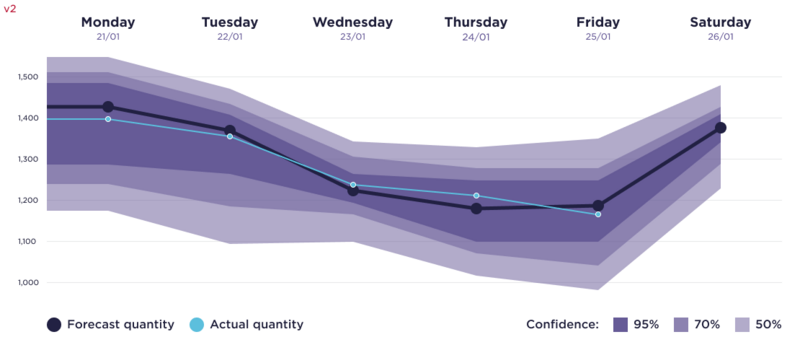
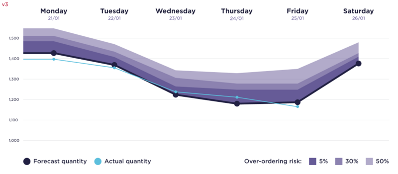
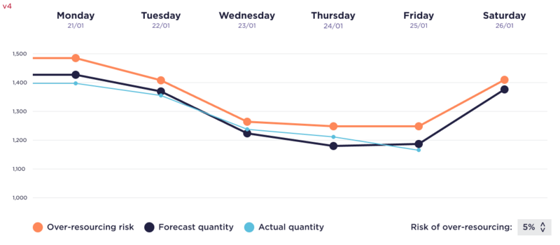
This user interface went through a rigorous process, from defining default components to designing sector-specific sections; every element was thought through and tested thoroughly. Some elements needed special consideration due to their specific use cases; one such component was a quantity forecast chart for logistics managers at last-mile shipping companies.
_dark.png)
Last-mile shipping requires up-to-date and accurate forecasts for the day ahead so logistics managers can book the delivery drivers needed. The primary conflict I had when designing this chart was whether the user should see the algorithms ‘confidence’ level; this is how confident the AI is in its prediction. This could be useful for the user because of how precise the forecast needs to be.
If the logistics manager booked in the specific amount the AI tells them to (the median amount), it could be slightly under what they need - but even one package undelivered is a bad thing! They usually overestimate their needs to make sure all packages are delivered, even if that means some drivers leave empty. This is where the confidence level, or as we ended up calling it, risk level, can help. Saying this, I wanted to make sure the interface remained as simple and usable as possible.
Here are some of the steps I took towards the final version (above). In-between each stage I would discuss the changes with the developers, product managers and UX researchers about where to explore next.

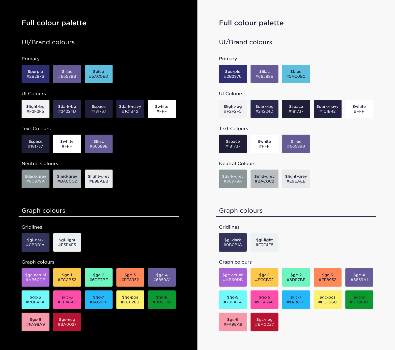
Creating an accessible colour palette
One of my biggest tasks for this user interface system was to create a custom colour palette that works for all colour blindness types while still carrying through the brand feel. This meant I couldn’t go for a default scientific colour palette such as Viridis. The colour palette was to be applied in advanced predictive graphs and charts as well as to style default UI elements such as buttons.

The palette is divided into two sections; user interface colours and chart/status colours. The chart colours needed to work in both a light and dark theme (defined by the UI colours) while still being distinct enough for colour blind people to work with - this is where a lot of the difficulty arose!
Above and below, you can see some examples of the colour palette in use.


I started this journey with a lot of research, reading scientific papers, seeing what other global companies like Bloomberg had implemented and just testing some colour choices on a few colour blind testers.
After many experiments, iterations and restarts - I had the finalised colour palette with twelve chart colours, two gridline colours and eleven UI colours. Below are the major versions leading to the final palette. The chart colours are designed to be used in sequence unless you use one of the status colours for a specific purpose.